Last updated: November 2026
This Niagara Launcher review starts with an honest confession: most Android launchers promise a cleaner home screen and then bury you in settings menus, icon packs and gesture diagrams. Niagara Launcher takes the opposite approach. It removes almost everything from your home screen, replaces the app drawer with a single alphabetical list, and asks you to trust that less really is more. After several weeks using it as a daily driver, the question is no longer whether the idea works, but whether you are the kind of Android user it was built for. This review covers the free version, the Pro upgrade, the widgets and gestures, and how Niagara compares with Nova Launcher and the stock launchers on Pixel and Samsung phones.
What Is Niagara Launcher?
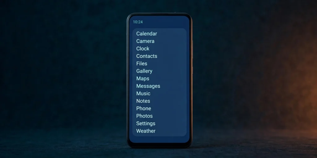
Niagara Launcher is a minimalist Android launcher developed by a small independent team, and it has quietly built one of the most loyal followings of any launcher on the Play Store. Where most launchers compete on customisation — grids, icon packs, animations, gestures — Niagara competes on restraint. There is no app drawer, no grid of icons and no pages of widgets: just a short list of favourites, a clock, and a clean alphabetical list of everything else, one swipe away.
The idea sounds drastic, and for the first day it feels it. But the design is deliberate. Niagara's developers describe their goal as a home screen that helps you get to what you need and then gets out of the way, rather than one that competes for your attention. There are no ads in the free version, no sponsored suggestions and no news feed trying to pull you back in. That alone sets it apart from several stock launchers, which increasingly treat the home screen as advertising space.
Niagara is also genuinely lightweight: a small download that uses very little memory and runs smoothly on older or budget phones that struggle with heavier launchers. It is a launcher that respects both your attention and your hardware.
First Impressions: A Home Screen That Gets Out of the Way
The first thing you notice after setting Niagara as your default launcher is the emptiness — and how quickly that emptiness starts to feel like a relief. Your wallpaper finally gets room to breathe. The clock sits at the top in a clean, minimal typeface, and below it are the handful of apps you actually use every day: perhaps your browser, messages, camera and music. Everything else is one swipe away, arranged in a single alphabetical column down the left edge of the screen.
There is almost nothing to learn: you tap an app to open it, and swipe down the edge of the screen to scroll the alphabet, with a letter appearing under your thumb to show where you are. It is the same muscle memory as scrolling through contacts, and it works well with one hand — on tall phones, your thumb never has to stretch to the top of the display.
The Alphabetical App List and Niagara's Gestures
The alphabetical list is Niagara's signature idea, and it is also its biggest dividing line. Instead of an app drawer that opens as a separate screen, every installed app lives in one continuous list on your home screen, sorted A to Z. You scroll it by swiping along either edge of the display, and a large letter indicator shows your position. A quick flick jumps several letters at once, so reaching an app starting with "W" takes a second, not a hunt through folders.
This approach has a real advantage over grids and folders: you never have to remember where you put something. There is no "which folder did I put the banking app in?" moment, because every app is exactly where the alphabet says it should be. New apps appear in the list automatically, in their proper place, with no organisation required. For anyone who has spent time curating folders only to forget their own system a month later, this is quietly liberating.
Gestures are deliberately minimal. There is no long list of swipe combinations to memorise. The edge swipe scrolls the alphabet, a swipe down anywhere opens notifications, and the Niagara button — a small pill at the bottom of the screen — opens your favourites or, with a swipe, your most recent apps. It is a launcher that asks very little of your memory, which is precisely the point. Power users who love Nova's deep gesture system will find this thin, but that is a deliberate trade-off, not an oversight.
Niagara Launcher Features Worth Knowing About
Beyond the list itself, Niagara Launcher features a set of thoughtful touches that reward daily use. The headline feature in recent versions is the Niagara button, a small pill-shaped control at the bottom of the screen that doubles as a home button and a shortcut to your recent apps. Tapping it returns you to your favourites; swiping up on it reveals a compact media player and quick access to your most recently used apps. It sounds minor, but it replaces the need to reach for the navigation bar or open the recents screen, and it becomes second nature quickly.
Notifications are handled elegantly. A small dot appears beside an app in the list when it has unread notifications, and swiping right on the app opens a pop-up showing the notification content and quick actions, such as replying to a message without opening the app. This keeps the home screen free of notification badges cluttering every icon while still keeping you informed. It is a small detail, but it captures Niagara's philosophy: information when you ask for it, silence when you do not.
The launcher also includes a built-in weather display and a calendar preview showing your next event, both presented as a single understated line of text that can be turned off. Niagara's settings fit on one short screen, with options for the clock style, font and icon appearance — nothing like the dozens of nested menus in Nova or Samsung's launcher.
Widgets, Notifications and the Niagara Button
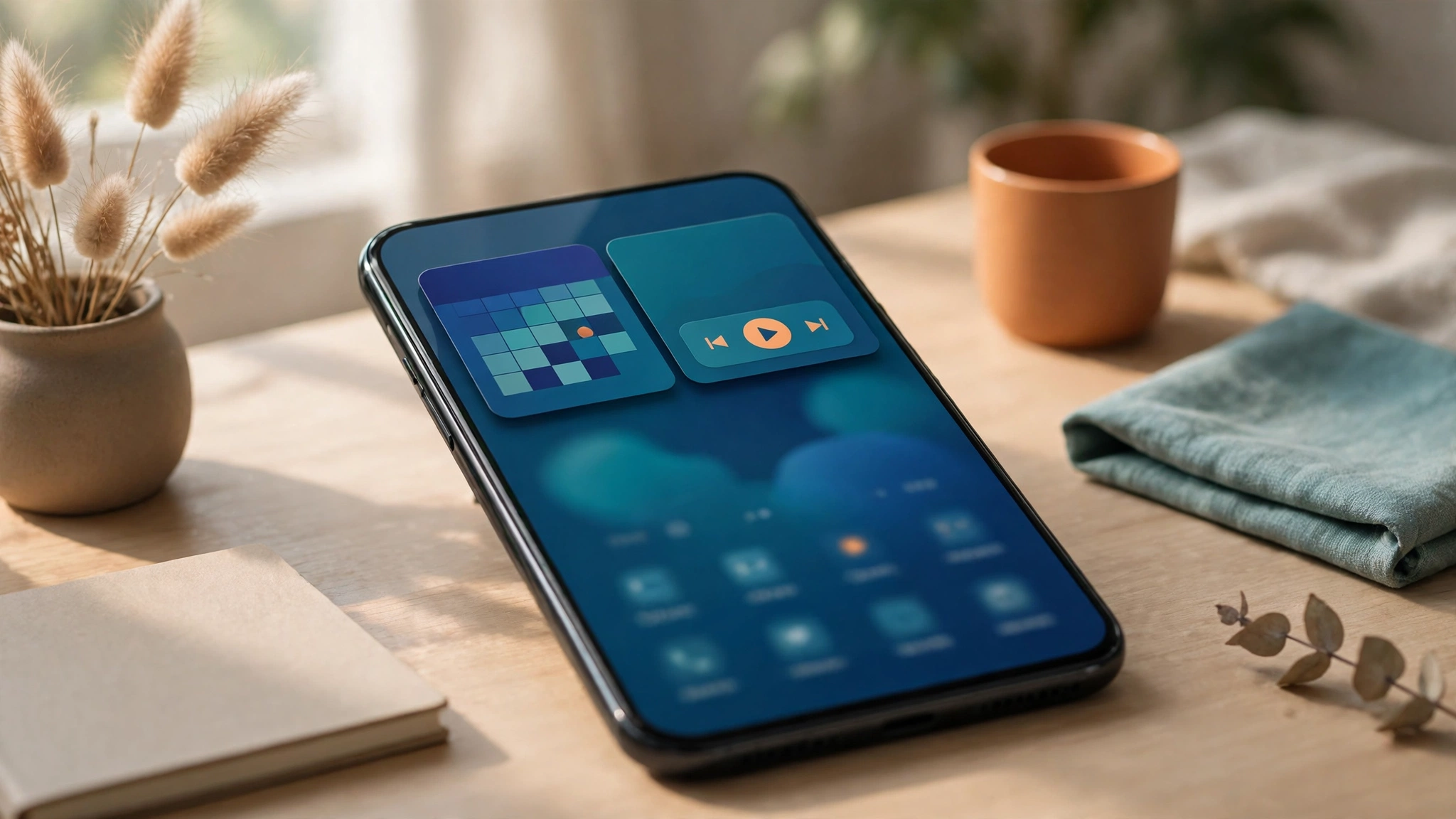
Widgets are where many minimalist launchers fall down, because a launcher with no grid has nowhere obvious to put them. Niagara's answer is the Pro-only widget stack: a single area at the top of the home screen where you can stack a calendar, music player and to-do list, swiping between them. It keeps the home screen clean while still giving you glanceable information, and it is one of the most commonly cited reasons people upgrade to Pro.
The free version is more limited here: it includes the clock and weather display, but a full widget stack needs Pro. If widgets are central to how you use your phone — a large calendar, a notes widget, a smart-home control panel — this is worth knowing before you commit. That said, Niagara Launcher widgets in the Pro stack work well, with smooth swiping between widgets and sensible sizing that never breaks the clean layout.
Notifications, as mentioned above, are handled through the app pop-up system, and it works well in practice. You can also enable a feature that shows a short preview of a notification directly on the home screen when it arrives, then fades it away. It is a gentle way of staying informed without the constant red badges that train you to check your phone every few minutes. Combined with the media controls built into the Niagara button, the launcher manages to cover the essentials — music, messages, calendar — without ever feeling busy.
Niagara Launcher Pro: Is It Worth It?
So, is Niagara Launcher Pro worth it? The free version is already a complete, usable launcher — no ads, no trial period, no features held back that make it feel like a demo. Pro is a subscription, priced by the developer at a modest annual or lifetime rate (check the Play Store listing for current pricing in your region), and it unlocks a handful of extras: the widget stack, unlimited favourites, custom fonts, more icon and clock customisation, app hiding, and full backup and restore.
Whether Pro is worth paying for depends on how you use the launcher. If you want widgets, the answer is straightforward: the widget stack is a Pro feature, and it is the single most useful upgrade. If you want to hide apps from the list — work apps, banking apps, or anything you would rather keep out of sight — that is also Pro-only, and for some people it is the deciding feature. The extra fonts and clock styles are pleasant but cosmetic; they are not the reason to subscribe.
Niagara Launcher vs Nova vs Stock Launchers
The comparison table below puts Niagara alongside the two alternatives most readers will be weighing: Nova Launcher, the long-standing king of customisation, and the stock Pixel launcher, which represents the default Android experience.
| Feature | Niagara Free | Niagara Pro | Nova Launcher | Stock Pixel Launcher |
|---|---|---|---|---|
| Price | Free, no ads | Annual or lifetime subscription | Free; Prime unlocks extras | Free, pre-installed |
| Home screen style | Alphabetical text list | Alphabetical text list | Customisable grid, folders, docks | Grid with At a Glance widget |
| App drawer | Single list on home screen | Single list on home screen | Separate drawer, highly customisable | Separate drawer, alphabetical |
| Widgets | Clock and weather only | Full widget stack | Full widget support anywhere | Full widget support anywhere |
| Icon packs | Supported | Supported | Supported, with more options | Not supported |
| Gestures | Minimal: edge swipe, Niagara button | Minimal: edge swipe, Niagara button | Extensive: dozens of gestures | Basic system gestures |
| App hiding | No | Yes | Yes, with Prime | No |
| Backup and restore | Limited | Full backup | Full backup with Prime | Cloud backup via Google |
| Learning curve | Very low | Very low | Steep | None |
| Best for | Minimalists, one-handed use | Minimalists who want widgets | Power users, tinkerers | People who want zero setup |
The Niagara Launcher vs Nova comparison comes down to a question of personality. Nova Launcher is the launcher for people who enjoy customising their phone: grids, gestures, icon packs, animations, backup and restore, and a settings menu that could fill a manual. Our Nova Launcher Prime review goes into that depth in detail. Niagara is the launcher for people who have finished customising and want to stop. It makes most decisions for you, and the decisions it makes are good ones.
For a broader look at launchers and other essential apps, see our round-up of the best free Android apps of 2026, where Niagara sits alongside the tools that genuinely earn a place on a home screen.
Performance, Battery Life and Privacy
Performance is one of Niagara's strongest suits. Because the launcher draws so little on screen — text, a clock, a short list — it uses very little memory and CPU. On a budget phone with 4 GB of RAM, where heavier launchers can stutter when returning to the home screen, Niagara stays smooth. Animations are simple and fast, and there is no heavy wallpaper parallax or live widget refreshing to drain the battery. In everyday use, the launcher's own battery consumption is negligible; any battery impact you notice will come from your apps, not from Niagara itself.
This review includes no laboratory battery benchmarks, because launcher battery tests depend heavily on the phone, wallpaper and widgets. What can be said honestly is that Niagara is among the lightest launchers available, and users switching from heavier launchers commonly report a snappier feel, particularly on older hardware.
Privacy is another quiet strength. Niagara is developed by a small independent team, and its privacy policy states that it does not sell personal data or serve ads. The launcher requests only the permissions it needs, and you can decline optional permissions without breaking the core experience — a meaningful contrast with free launchers that monetise through data or advertising. As with any app, check the current Play Store listing and privacy policy before installing, since policies can change.
A related point for security-minded readers: pairing a clean launcher with a trustworthy password manager is one of the simplest upgrades you can make to a phone, and our Bitwarden Android review explains why that particular app earns its place on a minimal home screen.
Frequently Asked Questions
Is Niagara Launcher free?
Yes. The free version of Niagara Launcher is fully usable, with no ads and no time limit. It includes the alphabetical app list, favourites, the Niagara button, notification pop-ups, icon pack support and Material You theming. The optional Pro subscription adds the widget stack, unlimited favourites, extra fonts and clock styles, app hiding, and full backup and restore. You can use the free version indefinitely and never feel pushed to upgrade.
Is Niagara Launcher Pro worth it?
For most people, Pro is worth it only if you want widgets or app hiding. The widget stack is the standout Pro feature, letting you stack a calendar, music player and to-do list in one clean area. If you do not need those, the free version is enough — and the developer offers a free trial of Pro if you want to test it first.
Does Niagara Launcher drain battery?
No, Niagara Launcher is one of the lightest launchers available, and its battery use in everyday use is negligible. It draws a simple text-based home screen with no heavy animations, live wallpapers or constantly refreshing widgets, so it places very little load on the processor. If your phone feels slow or its battery drains quickly, the cause is far more likely to be an app running in the background than the launcher itself.
Can I use widgets with Niagara Launcher?
Yes, but the full widget stack is a Pro feature. The free version includes a clock and weather display, while Pro lets you stack several widgets — such as a calendar, music controls or a notes widget — in a single area at the top of the home screen and swipe between them. If widgets are essential to your daily routine, factor the Pro subscription into your decision before switching.
Is Niagara Launcher better than Nova Launcher?
It depends on what you value. Niagara is better if you want a clean, fast, minimalist home screen that needs no setup — it makes the decisions for you, and it is excellent for one-handed use. Nova is better if you love customisation: grids, folders, gestures and deep settings. They serve opposite kinds of Android user, and most people who try both know within a week which camp they belong to.
Verdict: Minimalism Done Right?
Niagara Launcher is one of the few apps that fully delivers on its promise. It sets out to make a home screen that is calm, fast and genuinely useful, and it succeeds — provided you are willing to let go of grids, folders and widget-covered screens. The alphabetical list is fast and forgiving, the gestures are simple enough to learn in minutes, the performance on older phones is excellent, and the free version is generous enough that many people will never need to pay.
It is not for everyone. If you love customising your phone, or your home screen is a carefully arranged dashboard of widgets, Niagara will feel restrictive, and Nova Launcher remains the better choice for you. But if your home screen has become a source of distraction, or your phone feels cluttered and slow, Niagara is the most effective reset available — and it costs nothing to try.
For our money, the answer to the question in the title is yes: this is minimalism done right. Install it from the Play Store, give it three days, and judge it on the third day, not the first.
Browse more honest app reviews in our App Reviews category to find the next app worth a place on your home screen.